For this task I have to pick out a painting, photo, film or
game, I then need to analysis and to say what I like about it. There are a few
that I would like to look at but I only need to pick one. I had a look throw
some of my favourite artist to find pieces of work that I like. In the end I
choose a digital painting called “Dunwall Bridge” by Viktor Antonov. It was
created as any concept pieces for a game called dishonoured.
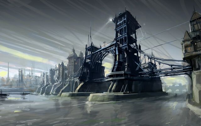
Why did I pick it?
I pick this because Dishonoured is one of the few games to
make me stop and look around, not to find hidden things but just so I could see
how great it looks. That is why I love looking at the concept work for the game
and seeing how close it matches to the game. It is also made by Viktor Antonov,
who is an artist that I have been a big fan of because of his work on half-life
2, which is my favourite game of all time. I think the best way to look into
the image is to break it down into the elements
of design. These are Line, shape, colour, texture, tone, form, space, and
depth.
Line, where do I start looking and where do I
go from there?
When I first look at this
image the first thing that stands out to me is the light, at the top the bridge
close to the middle. From there I look down the tower looking at the lines that
go down it. About half way down I follow the roof to the right, of what I think
is some sort of control room. This then leads me to a long metal wire that curves
down to the very right of the image. From here I then go to a building that
bring to some metal looking pips that go back left, under the first tower. I
keep following this line left till I get to the second tower. When I get to the
second tower I follow the lines up the tower to the very top of it and then go
along the top to the left that leads me onto the buildings to the left and I
keep going left following the roofs till I get to the end.
This gives you a good look
of the whole image and keeps you very close to the 2 tower of the bridge. What
is the point of this image to show. The line takes you on a very good look but
it shows a very good point on where to start.
Shape, what different shapes stand out to me?
The main part of this image is the bridge so I think it
would be best to talk about the shape of that. Just by looking at the bridge,
you can see there are many geometric shapes, they make the outside of the
bridge and there are many more within the bridge itself. The 2 towers are like
simply block shapes with an ellipse in the centre and a right angle triangle to
the right side to show the metal wires. Within these shapes there are more
geometric shapes like on the towers there are parallelograms that show the metal
building supports.
Colour, what dose he
use and why?
Right away I see a lot of dark blues and grey blues. This
gives it a very well-worn and grimy feel to the image. The colours used on the
bridge also give it a very industrial feel to, what gives an idea of what going
on in this world.
Texture, how are
surface Martials shown?
I see that a lot of the textures have a matt and smooth look
to them this can be seen in the water at the bottom of the image is shown very
nicely by the way by the smooth lines of different colourer that blend in well
with each other but also the darker colours to show the reflection of the
bridge and buildings. The metal of the bridge can be seen; by the 1 colour he
use then adds 1-2 more colours to show shadows or reflection of other parts of
the bridge.
Tone, how is shading
used to show form?
There is a lot of shading used on this image, mostly on the
bridge to make it stand out and have depth to it. On the first tower (the on
close to the right) you can see how different tones have been used to show the
support that keep the tower up but you can all so see the different floors that
go up the tower. There is also a nice use of tone used on a part below the
building on the left. You can really see how they come out of the wall into the
water by the dark tone used to show one side of the walls. By his use of tone
he makes the bridge stand out very well by using a gradient that is dark at the
top and bottom of the image and then making it lighter in the centre because
the dark colours used on the bridge make it really stand out nicely, he also
use more lighter colours on the buildings to the left of the bridge so that
they don’t take your eyes away from the bridge.
Form, how does the
image look 3D?
The form of the bridge is mostly because of the tone and
colours used but it allows you see to see what the width of the bridge is and
that you can then use that with other objects in the world to get an idea of
how big it is.
Space, what space is
used in the image?
The most space is used up by the bridge because it is what
the image is about but if you look at the image in the rule of 3rd
you can see a lot more going on. The left line horizontal goes right up the
left tower of the bridge and both vertical lines meet the tower as well, one
half way up the tower and then goes along the bridge to the second tower and
the other line at the bottom of the tower. This is a really good use of the
rule of 3rd and helps make the bridge stand out more the eye.
Depth, what is in the
foreground, background, and middle ground?
There is nothing in the foreground but there are 2 things in
the background that show depth in the image. On the very middle left you can
see what looks like to be buildings and towers but not with any detail on them
but you can still make out what they are meant to be. If you also look to the
very right and follow the water you can see in the background there is another
bridge, again there is no detail on it but you can tell what it is meant to be.
This help fill in what would be empty space but it does not take your eyes off
what you are meant to be looking at.
This is how I see this image but if you can’t maybe this
will help

Line – red
Shape – yellow
Texture – dark blue
Tone – Green
Form – light blue
Space – purple (rule of 3rd)
Depth – orange
I think I have learnt a lot by looking at this image and I
think I could maybe use it on my future work if I need to.
Websites used
No comments:
Post a Comment